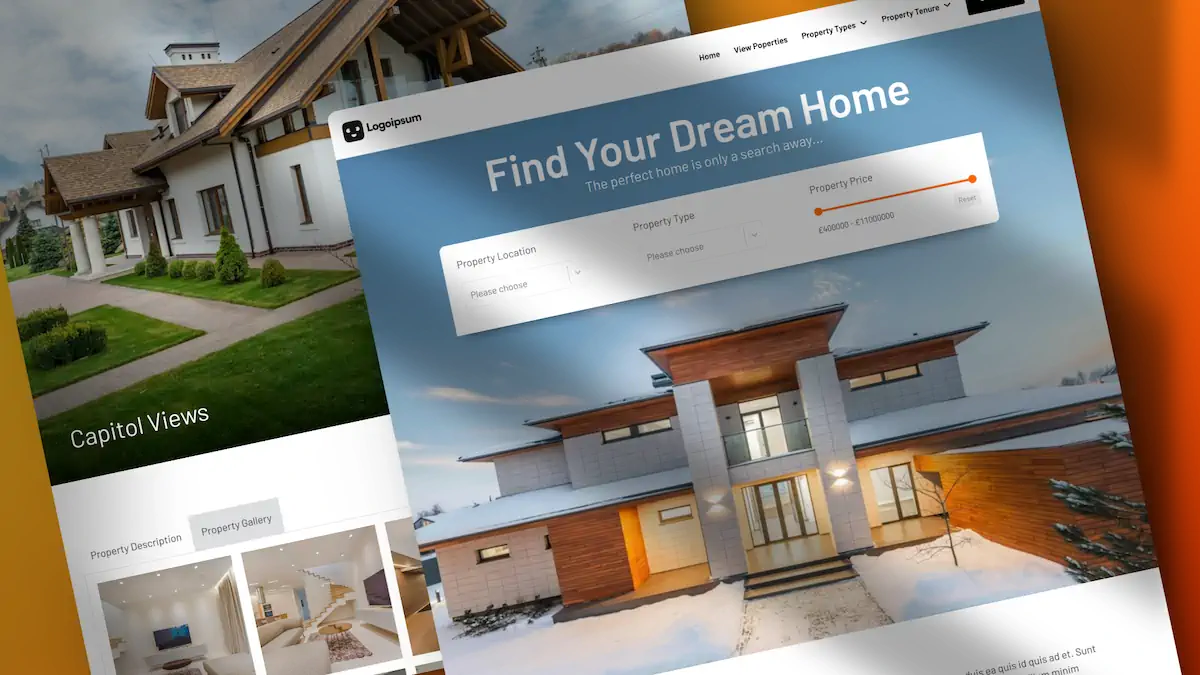
In this post, we’ll explore how to create these effects using Bricks Builder. However, these techniques can be applied with any builder that allows for custom CSS.
What Are Glassmorphism and Gradient Meshes?
- Glassmorphism is a design trend that mimics the appearance of frosted glass. It typically involves a semi-transparent background with a blur effect, creating a visually appealing and modern look.
- Gradient Meshes create smooth transitions between multiple colours, adding depth and dimension to your design. They are particularly effective for backgrounds and hero sections.
Getting Started with Bricks Builder
Before diving into the specifics, it’s important to note that while this tutorial uses Bricks Builder, the same principles can be applied to other website builders that support custom CSS.
Creating a Gradient Mesh
- Select the Hero Section: Select the hero section where you want to apply the gradient mesh. Ensure you have selected the correct element or section.
- Access the CSS Section: Navigate to the CSS section in Bricks Builder. Here, you’ll target the root element of the hero section.
- Use the Mesher Website: Instead of manually creating the gradient mesh, use the free Mesher website by CSS Hero. This tool allows you to edit and create gradient meshes visually. You can drag points around to adjust colours and make the desired effect.
- Export and Apply the CSS: Once you’re happy with your gradient mesh, export the CSS code and copy it to your clipboard. Head back to Bricks Builder and paste the code into the CSS panel for the root element. Save your changes and preview the result. You should see your beautiful gradient mesh applied to the hero section.
Enhancing the Gradient Mesh with Overlays
You can add an overlay gradient to make the gradient mesh even more subtle and visually appealing.
- Select the Hero Section Again: Ensure the hero section is still selected.
- Apply the Overlay: In the gradient and overlays section, apply the overlay. Select your colours and adjust the opacity to create a smooth transition effect. This will allow the top colour to show through and fade into the background colour.
- Save and Preview: Save your changes and preview the result. You’ll notice a more subtle and refined gradient effect.
%root% {
background-color:#c299ff;
background-image:
radial-gradient(at 41% 17%, hsla(278,78%,67%,1) 0px, transparent 50%),
radial-gradient(at 0% 9%, hsla(9,90%,77%,1) 0px, transparent 50%),
radial-gradient(at 48% 82%, hsla(310,93%,71%,1) 0px, transparent 50%),
radial-gradient(at 93% 62%, hsla(35,67%,75%,1) 0px, transparent 50%),
radial-gradient(at 71% 41%, hsla(302,82%,61%,1) 0px, transparent 50%),
radial-gradient(at 3% 6%, hsla(240,88%,68%,1) 0px, transparent 50%);
}
Creating a Glassmorphism Navigation Bar
Next, we’ll create a stunning glassmorphism effect for the navigation bar.
- Edit the Header Template: Start by editing the header template in Bricks Builder.
- Make the Background Transparent: Select the header section and remove the background to make it transparent. Also, remove any border or box shadow.
- Add Padding and Round Corners: Select the container with navigation elements. Add some padding and round the corners to give it a floating effect.
- Use CSS.glass: To create the glassmorphism effect, use the free CSS.glass tool. This tool adjusts transparency, blur effects, background colours, and outlines. Once you’re satisfied with the effect, copy the CSS code.
- Apply the CSS in Bricks Builder: Head back to Bricks Builder, ensure the container is selected, and paste the CSS code into the CSS panel. Save your changes and preview the result.
%root% {
background: rgba(255, 255, 255, 0.47);
border-radius: 16px;
box-shadow: 0 4px 30px rgba(0, 0, 0, 0.1);
backdrop-filter: blur(11.4px);
-webkit-backdrop-filter: blur(11.4px);
border: 1px solid rgba(255, 255, 255, 0.3);
}
If you’d prefer to have the glass morphism effect only on the desktop, you can easily add a simple Media Query to handle that. Here’s a modified version of the CSS code with the media query in place.
%root% {
@media screen and (min-width: 992px) {
background: rgba(255, 255, 255, 0.47);
border-radius: 16px;
box-shadow: 0 4px 30px rgba(0, 0, 0, 0.1);
backdrop-filter: blur(11.4px);
-webkit-backdrop-filter: blur(11.4px);
border: 1px solid rgba(255, 255, 255, 0.3);
}
}
Final Thoughts
By following these steps, you can create stunning glassmorphism and gradient mesh effects in Bricks Builder or any other builder that supports custom CSS. These effects can significantly enhance the visual appeal of your website, making it more modern and engaging.

