But like any powerful tool, it can feel overwhelming at first, particularly if you lean more towards the visual side of design rather than writing code.
The good news? If you’re using Bricks Builder, version 2.0 introduced a fantastic new feature: the Visual CSS Grid Builder. Let’s take a look at what it is, how it works, and how it can help you create more engaging and responsive layouts with ease.
Getting Started with the Visual Grid Builder
First things first, let’s set the scene. Imagine a basic page with a section and a container. Inside that container, you’ve had six blocks, each one labelled 1 through 6.
To start building a CSS Grid layout:
- Select the container (not the section).
- Look on the left-hand panel under the Content tab.
- Change the display from Flex to Grid.
At this point, you won’t see any visual changes on the page; that’s expected. However, you will notice a new icon that appears in the interface. This little icon is your gateway to the Visual CSS Grid Builder.
Click it, and you’ll open up a visual interface where you can build your grid. If you prefer to work visually rather than entering values manually, this tool will be a game-changer.
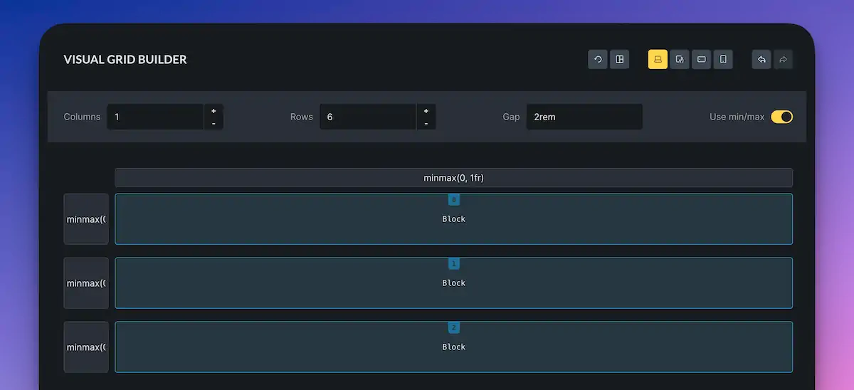
Understanding the Grid Builder Interface
Once inside the builder, you’ll see:
- A visual preview of your grid.
- Controls for resetting the layout and selecting breakpoints (such as desktop, tablet portrait, mobile landscape, etc.).
- Options for setting the number of columns and rows.
- A choice between using fractions (fr) or minmax values for more control over sizing.
- A gap field to control spacing between grid cells—where you can use values like rem, em, px, or even CSS variables.
Creating a Basic Grid
Let’s say you want to make a simple three-column and two-row grid. You enter “3” for columns and “2” for rows. Want a bit of spacing? Set the gap to something like “2rem”. Simple as that.
- The real beauty is how the layout adapts across different breakpoints. For example:
- On the desktop, you have three columns and two rows.
- On a tablet in portrait mode, you can switch to a 2-column and 3-row layout.
- On mobile devices, use a 1-column layout with six rows.
The interface lets you tailor layouts visually for each device size. It cascades from desktop down, so any changes you make at a lower breakpoint affect everything beneath it—unless you override it. This makes managing responsive designs a breeze.
Getting Creative
You’re not confined to a strict grid; flexibility is built in. You can:
- Change column and row sizes manually (e.g., update 1fr to 2fr for more space).
- Use the corner handles on the visual grid to drag and resize individual blocks.
- Click on an item in the grid to edit properties or rename blocks.
- Reorder items using grid indices to change how items are arranged in the DOM.
All of this is done through a visual interface, but under the hood, it’s writing clean CSS for you. That means you can switch back to the left panel in Bricks if you prefer to tweak things there—or mix and match as you work.
Using CSS Variables
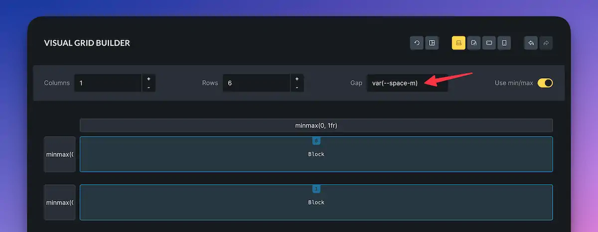
For those working within a design system or utility class framework, such as Core Framework, you can use custom variables in the gap field or other areas. Just type something like var(--space-m), and you’re good to go. It maintains consistency with the rest of your design.
Wrapping It Up
The Visual CSS Grid Builder in Bricks 2.0 makes building layouts easier, faster, and more intuitive—especially for those who prefer a visual approach to designing. You can quickly build complex, responsive grids without needing to write every line of CSS manually, and everything remains fully customisable if you want to dive deeper.
Whether you’re just starting or looking to elevate your layout game, this tool strikes the perfect balance of power and simplicity.