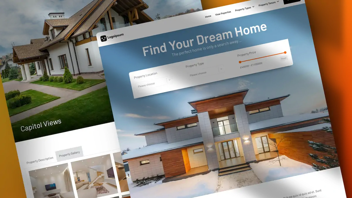
Over the past 15 years, I’ve seen many trends, and the return of depth and realism in web design is worth embracing.
In this blog post, we’ll explore how to add depth to your designs, making them more captivating and visually appealing.
Why Add Depth to Your Designs?
Flat design has been a dominant trend, but it’s gradually making way for more dynamic and interactive layouts. Adding depth to your designs can make them stand out and provide a more immersive experience for users. This technique involves creating visual layers that give the illusion of elements lifting off the page, adding shadows, and creating a sense of separation from the background.
Practical Examples of Adding Depth
Let’s examine some practical examples to understand how to add depth to your designs. We’ll use Bricks Builder for this tutorial, but the principles apply to other tools like Elementor or even plain CSS.
Example 1: Hover Effects
One of the simplest ways to add depth is through hover effects. Imagine a flat layout where elements appear to lift off the page when hovered over. You can achieve this effect by adding a drop shadow and changing the background colour.
- Select the Element: Open your structure panel and select the element you want to work with. In this example, we’ll use a card wrapper that contains multiple boxes.
- Apply Global Classes: Using global classes ensures that changes made to one element are applied to all similar elements.
- Switch to Hover Mode: Change the state to hover mode to apply effects that only appear when the element is hovered over.
- Change Background Colour: Select a lighter background colour to make the element stand out.
5. Add a Box Shadow: Open the box shadow section and add a shadow. Choose a colour that complements your design, and adjust the blur, spread, and opacity to achieve the desired effect.
Example 2: Smooth Transitions
A sudden appearance of shadows can look abrupt. To make the transition smoother, add a transition effect.
Example 3: Realistic Shadows
- Add Transition in Normal State: In the CSS section, add a transition property with a duration of 0.5 seconds.
- Add Transition in Hover State: Repeat the same transition property in the hover state.
You can use a multiple-box shadow generator for a more realistic shadow effect. This allows you to stack multiple shadows and adjust each one independently.
- Use an Online Generator: Tools like the CSS Multiple Box Shadow Generator let you customize shadows with various controls.
- Copy and Apply CSS: Once you’re satisfied with the shadow effect, copy the CSS and apply it to your element in Bricks Builder or any other tool you use.
Example 4: Advanced Shadow Effects
If you have access to advanced tools like Advanced Themer, you can create even more sophisticated shadow effects.
- Open Box Shadow Generator: Use the built-in box shadow generator in Advanced Themer.
- Choose a Preset: Select from various presets to apply complex shadow effects quickly.
- Customize Shadows: Adjust colours, opacity, and other properties to fine-tune the shadow effect.
Conclusion
Adding depth to your web designs is a powerful way to enhance user experience and make your site more visually appealing. Whether using Bricks Builder, Elementor, or plain CSS, the techniques discussed here can help you achieve stunning results.
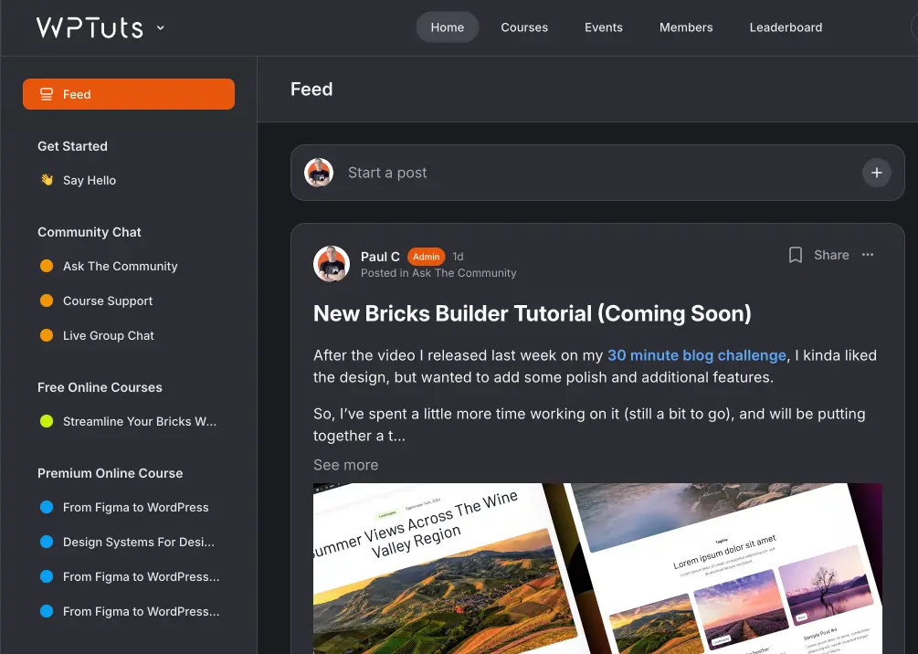
If you want to learn more about advanced design effects like Glassmorphism, check out my tutorial.

