In this guide, we’ll walk you through using the new CSS Framework options introduced in Bricks 2.2 to create a custom colour palette. We’ll keep things simple and relaxed, so whether you’re just getting started or looking to optimise your page design workflow, you’ll find something useful here.
We’ll be focusing entirely on the Colours section of the framework, with future posts covering spacing, typography and more.
Getting Started with the Framework Styles
To start, click on the Styles icon at the top left of Bricks Builder. This opens a panel that shows all your framework sections – a central place to manage your design system.
If it’s your first time exploring this area, it may look a bit unfamiliar, especially if you’ve used older versions of Bricks. On the left-hand side, you’ll see icons for various framework components. You can also preview your styles at different breakpoints, such as desktop and tablet.
For this tutorial, we’ll create a brand new style – a blank canvas where you can start from scratch.
Creating a New Colour Palette
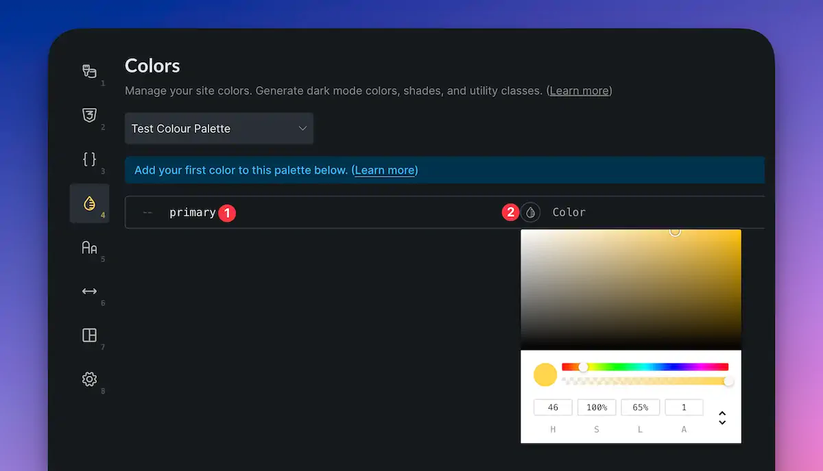
Head over to the Colours tab and click the plus icon to create a new palette. Give it a sensible name – such as “Framework Colour Palette” – and click Create. You now have an empty palette ready to fill.
Adding Colours to Your Palette
The first thing you’ll need to do is name your colour variables. Logical names like “primary”, “secondary”, “accent”, etc., work well. For example, start with “primary” as your base colour.
Bricks gives several options for defining colours:
- HSL & Alpha
- RGB & Alpha
- Hexadecimal
- Named colours (like “red” or “blue”)
Choose whichever method you’re most comfortable with, but using HSL(A) is recommended if you want to easily generate shades and tints later.
Pick your colour (e.g., teal or another colour you prefer), then click Add Colour. Repeat this process to add complementary colours (e.g., for secondary, you might pick a warm orange to contrast with teal).
Customising Colour Options
Once your basic colours are in place, you can dive deeper.
Enabling Dark Mode
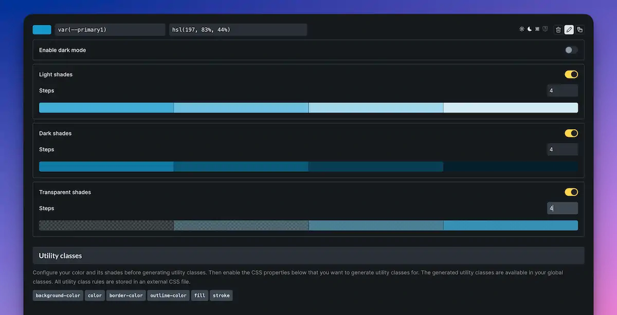
Toggle on the “Enable Dark Mode” option to set an alternate version of your colour for dark backgrounds. You’ll get two swatches – one for the light theme, one for dark – which you can customise separately. Or you can let Bricks auto-generate suitable alternatives.
Adding Light and Dark Shades
Want a range of tints and shades based on your base colour? Toggle on “Light Shades” and “Dark Shades”. By default, Bricks adds 10 steps, but you can adjust this to suit your needs (such as 4 steps for a more focused palette).
Adding Transparency Variants
You can also generate transparency layers for each colour. Turn on Transparency, and specify how many levels you want. Again, Bricks handles naming and creation for you, generating variables such as `–primary-t1`, `–primary-t2`, and so on.
Each generated colour swatch can be hovered over to preview the value, copy it, or edit it. This gives you full control if you want to tweak any of the autogenerated colours.
Using Dark Mode with Generated Colours
If you’ve enabled dark mode and generated shades or transparency values, Bricks will automatically create dark-mode versions of those as well. It’s a smart system designed to help you manage both themes without doubling your workload.
Understanding Colour Overview and Icons

Above each colour, you’ll see icons that give a visual summary:
- How many light/dark shades are created
- How many transparency levels exist
- Whether utility classes are available
It gives you a quick glance at how extensive your palette is without having to expand anything.
Generate Harmonies (If You Struggle with Colour Matching)
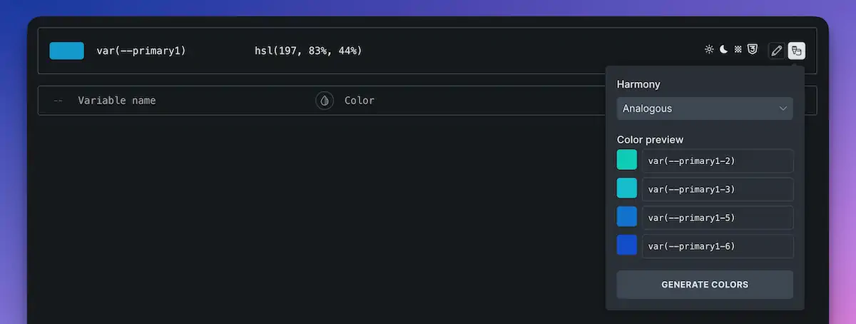
If you’re not confident choosing complementary colours, Bricks has a handy Harmony Generator. Simply select your base colour, click “Create Harmonies”, and choose from colour theories like:
- Monochromatic
- Analogous
- Complementary
- Triadic
- Tetradic
Bricks will then generate a palette of colours for you based on your chosen harmony type. You can delete any that don’t suit and hit “Generate Colours” to add them to your palette.
Enabling and Using Utility Classes
Want to apply your colour palette without manually entering variables? Bricks includes utility class generation.
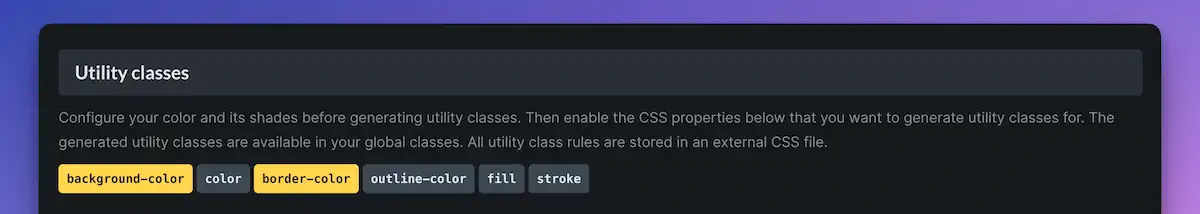
- Utility classes follow a simple naming system:
- `bg-primary` for background colour
- `text-primary` for text colour
- `border-primary` for border colour
You can enable whichever classes you want. Once enabled, they become available in your class dropdown when styling elements. Change the colour variable later, and everything using those classes updates automatically.
For example:
- Style a button with `bg-primary`, and it’ll adopt your primary background colour.
- Add a solid border to another element, assign `border-primary`, and you’re done.
Making Real-Time Changes
Let’s say you’ve used your colours throughout your design and now want to update the look. Simply update the base colour or any of its variants, hit Save, and your design reflects those changes wherever the variables or utility classes have been used.
Viewing the Colour Palette in Use
When you’re working with an element and open the colour picker, you’ll see your custom palette listed, with swatches labelled by their variable names (for example, `primary-l1`, `primary-d2`, etc.). If you have multiple palettes, you can switch between them easily.
This makes applying consistent colour styles a breeze, especially for larger projects or those that need to toggle dark mode easily.
Wrapping Up
There you go – everything you need to know to get started with the new Colours feature in the CSS framework section of Bricks 2.2+. It’s a brilliant time-saver that reduces a lot of repetition in your design workflow.
In upcoming posts, we’ll dive into Spacing, Typography, and how to tie it all together into a robust, reusable design system for all your projects in Bricks.
Until then, happy designing!