The goal is to set up fluid-type scales (for headings and body text), generate the relevant CSS variables, and, optionally, create utility classes you can apply anywhere.
Getting to the Typography settings
Open the Styles panel.
In the Bricks editor, click the options in the top-left and choose Styles. This opens the new Styles panel, where everything is grouped into sections such as theme styles, classes, variables, colours, typography, and more.

Find the Typography section.
Scroll down the left-hand list and click Typography. This is where you create and manage typography scales.
While you’re working, it’s worth noticing the preview tools in the top-right:
- The toggle canvas preview (the eye icon) lets you see the results of your typography settings in an actual page preview.
- Breakpoint preview lets you see how things change across desktop, tablet, mobile, and more. This is especially useful for fluid typography.
- There’s also an option to maximise the workspace, which can help if you want fewer distractions.
Creating a heading typography scale (H1–H6)
The first scale we’ll create is for headings.
Create a new scale
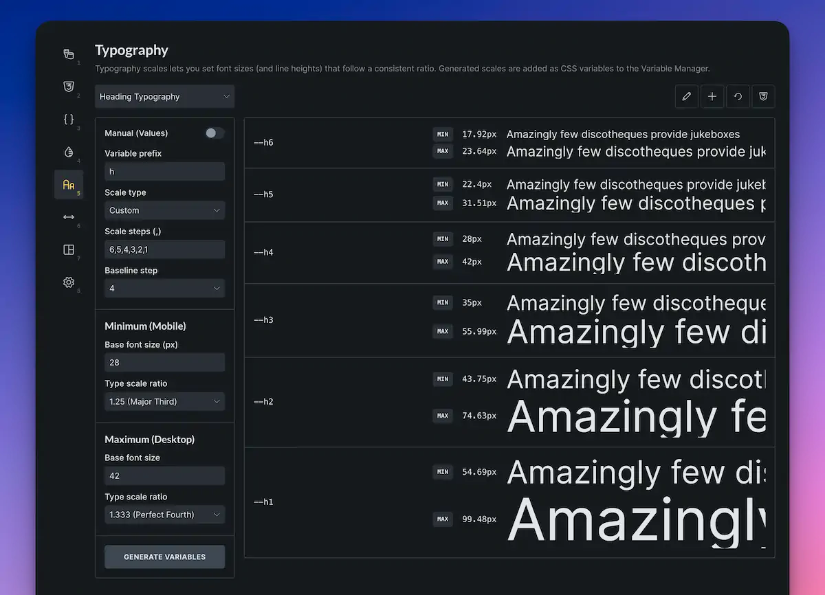
In Typography, you’ll see a field to name your scale. Create one called headings (or whatever name fits your system).
Understand the main scale controls.
Inside a scale, you’ll typically work with:
- A setup area (for configuring the fluid scaling behaviour)
- A visual preview of the sizes
- The variable names that will be generated
- Options in the top-right to rename/reset/create scales and inspect the generated CSS
Manual values toggle (optional)
There’s an option called Manual values. By default, Bricks uses the scale settings (ratios, baseline, min/max) to automatically calculate everything.
If you enable Manual values, you can override the minimum and maximum for each step. For a straightforward setup, leave it disabled and let the scale handle it.
Set a variable prefix that makes sense.
There’s a Variable prefix field. For headings, you might prefer H over a generic prefix like text.
Change the prefix to H so your variables end up looking like H1, H2, H3, and so on (depending on the scale type you choose next).
Choose the scale type: T-shirt, numeric, or custom
Bricks offers different naming styles for the scale steps:
- T-shirt sizing (2XS, XS, S, M, L, etc.)
- Numeric (1, 2, 3, etc.)
- Custom (you define the steps yourself)
For headings, custom is often the most intuitive because you can align the steps with actual HTML headings.
Configure custom steps for H1–H6.
If you switch to a custom scale, you can create steps such as H1, H2, H3, H4, H5, and H6.
One thing to watch: the order can be reversed depending on how you set it up (for example, H1 ending up smallest). If that happens:
- Remove any unneeded step (like H7)
- Reorder/reverse the steps so H1 is the largest, and H6 is the smallest.
Once done, you’ll have a scale that matches how you naturally think about headings.
Pick your baseline step.
The baseline step uses your base minimum and maximum values.
For example:
- If the baseline is H3, H3 will use the base min/max values.
- Steps above and below will scale relative to that.
You can adjust the baseline to make the whole system feel bigger or smaller, but keeping it around H3 is a sensible default for many designs.
Set the minimum and maximum sizes.
These are the min/max values for your baseline step (for example, H3). Bricks will calculate the rest.
In the video example, the baseline was initially set to 16 (min) and 20 (max), but then increased to something more heading-like, such as:
- Min: 24
- Max: 32
Once you change these, the entire heading scale adjusts accordingly.
Choose a type scale ratio.
The ratio controls how dramatic the size jumps are from step to step.
A larger ratio creates bigger differences (so H1 becomes much larger than H6). A more modest ratio creates a tighter, more restrained hierarchy.
Pick something that suits your design style, then check the preview.
Inspect the generated CSS (optional, but useful).
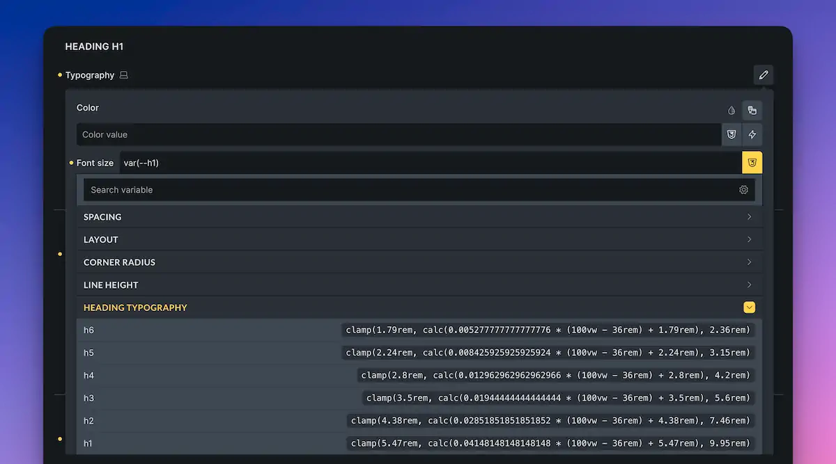
You can view the generated CSS for the scale. Even if you enter values in pixels, Bricks will output a fluid solution using clamp() and rem-based values, giving you responsive type sizing without having to hand-write the maths.
Generate variables.
When you’re happy, click Generate variables. This creates the CSS variables for the scale (H1–H6).
You can confirm this in the Variable manager, where you’ll see a new group (for example, headings) containing the six generated variables.
Don’t forget to save once you’ve generated them.
Applying heading variables to your Theme Styles
Generating variables is only half the job. You’ll usually want to connect them to your global typography settings so every heading element uses the scale automatically.
Go to Theme Styles
In the Styles panel, open your Theme Styles (the one assigned across your site).
Open Typography for headings
Inside Theme Styles, find the Typography section where headings are listed (Heading 1, Heading 2, etc.).
Set each heading’s font size to the matching variable
For each heading level:
- Click the font-size control
- Switch to variables
- Select the matching variable (H1 for Heading 1, H2 for Heading 2, etc.)
You can leave other typography settings as is if you only want to control sizing with the scale.
Once applied, any Heading element you add to the page will automatically use these fluid sizes.
Making changes later
If you want to tweak the look later (bigger headings, tighter scale, different ratio):
- Return to Typography
- Adjust the scale
- Generate variables again (you’ll be asked to overwrite)
- Check the preview to see the update across the site.
Because your Theme Styles reference the variables, your heading sizes are consistent everywhere.
Creating a second scale for body text
Next, create a scale for normal text (paragraphs, general UI text, etc.).
Create a new scale called text.
Back in Typography, create a new scale and name it text.
For body text, the default setup is often perfectly fine:
- T-shirt sizing steps (2XS through 2XL)
- Baseline step set to M (Medium)
- Base min/max values are commonly around 16 and 20 (depending on your preference)
Generate and apply the Body typography.
To use it globally:
- Go to Theme Styles
- Find the Body typography settings.
- For font size, switch to variables and choose Text M (or whichever step you want as your default)
Now your default body text is fluid too.
(Optional) Creating utility classes for typography sizes
Utility classes can be handy when you want a quick “one-shot” class that does one job, like forcing a specific text size for a particular element. Even if you don’t use utilities often, it’s useful to know how.
Go into your text scale.
Open the text typography scale.
Define a utility class pattern using a wildcard
Create a utility class name like:
text-*
The asterisk acts as a wildcard. Bricks will replace it with the step names from your scale, creating a class for each step (e.g., text-xs, text-m, text-xl, etc., depending on your exact naming).
Choose the CSS property.
Set the CSS property to:
font-size
Generate utility classes
Click Generate Utility Classes.
If you inspect the generated CSS, you’ll see all utility classes created and mapped to the appropriate variables.
Use the utilities on any text-based element
You can now apply these classes to things like:
- Links
- Text blocks
- Buttons
- Any element where font-size applies
For example, applying the text-2xl utility class to a link will instantly set its font size to 2xl, without needing to create a bespoke class for the element.
Wrapping up
Bricks 2.2’s typography scaling makes it straightforward to:
- Build fluid, responsive typography scales
- Generate variables automatically (using clamp() under the hood)
- Apply those variables globally through Theme Styles
- Optionally generate utility classes for quick, targeted overrides
If you’re also building out a complete framework inside Bricks, you can combine these typography scales with your spacing and colour systems so the entire site stays consistent and easy to maintain.