In this tutorial, we’ll walk through how to serve different images for different device breakpoints using Bricks Builder, giving you precise control over how your site looks and loads on any screen size.
Why Image Optimisation Matters
Large, unoptimised images are one of the most significant contributors to slow website speeds. On mobile devices with slower data connections, this becomes a serious problem. The solution? Use images tailored to each device size.
Bricks Builder makes it incredibly easy to do this by allowing you to assign specific images to different breakpoints without requiring extra plugins or code.
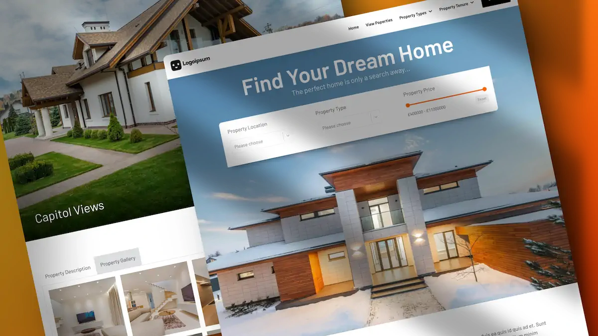
The Setup: Hero Image Example
Let’s imagine we have a hero section with a large image designed for desktop.
By default, if we view this same hero section on smaller breakpoints, such as mobile or tablet, the same image simply scales down. That’s inefficient and not ideal for performance.
Step-by-Step: Assigning Breakpoint-Specific Images in Bricks
Step 1: Select Your Image Element
In Bricks Builder, select your Image element (e.g., the hero image).
Step 2: Add Additional Sources
In the image settings panel, you’ll see the “Additional Sources” option.
Click this to start adding image versions for each breakpoint.
Step 3: Choose Your Breakpoints
Bricks allows you to set different images for:
- Mobile Portrait
- Mobile Landscape
- Tablet Portrait
- Custom Media Queries (for advanced needs)
Important: Always start with the smallest breakpoint and work your way up. Doing it in reverse can lead to unexpected behaviour.
Step 4: Upload or Select Your Images
For each breakpoint:
- Choose the appropriate screen size.
- Select or upload an optimised image version (scaled and cropped as needed).
- Set the image size if multiple versions exist.
- Repeat for each additional breakpoint.
For example:
- Mobile Portrait: Insert a cropped mobile image.
- Mobile Landscape: Use a slightly wider version.
- Tablet Portrait: Choose another appropriate image.
- Desktop: Remains the default image.
Step 5: Save and Test
Once all images are assigned, click Save and preview your layout in different breakpoints using Bricks’ responsive view tools.
You should now see the correct image displayed for each device size.
Real-World Use: One Image, Multiple Sizes
In most use cases, you’ll use the same image across all breakpoints, but at different resolutions and crops. This saves bandwidth and improves load times, particularly on mobile devices.
However, if needed, you can also serve entirely different images based on context, design, or user behaviour.
Conclusion
With just a few clicks, you can significantly enhance your site’s performance by configuring responsive images properly in Bricks Builder. It’s easy, efficient, and makes a big difference to both load speed and user experience.
Pro Tip: Tools like TinyPNG or ImageOptim can help compress and optimise images before uploading them to your WordPress site.