They’re powerful, flexible, and once you’ve set them up, you’ll never want to build without them. In this post, we’ll break down exactly what they are, how to set them up, and why they’re worth your time.
What Are Theme Styles in Bricks?
Theme Styles are collections of default settings. Think colour palettes, typography, spacing, button styles, layout preferences – all the things you’d otherwise set individually on each element. Theme Styles allow you to apply these settings once, and they take effect everywhere across your website.
It’s like having a custom design foundation for every new section, container, button or heading you add. Is it more efficient than adjusting each one manually?
How to Create a Theme Style
Getting started with Theme Styles is straightforward. Here’s how:
- Open a page or template in Bricks – any type will do.
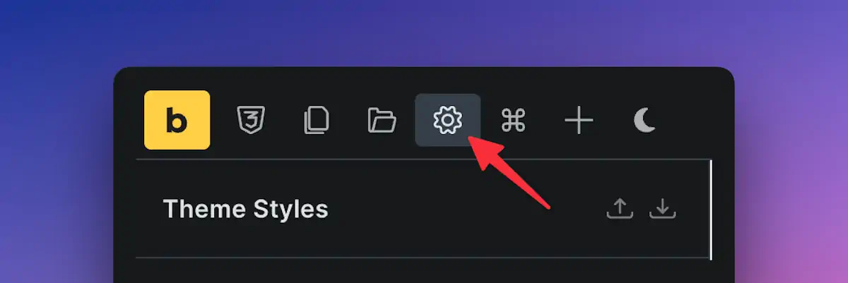
- Click the settings cog icon in the top left corner.
- Go to the Theme Styles tab.
- Click to create a new theme style. Name it something clear, like “Base Theme” or “Client A Theme”.
- Click “Save” – and just like that, your new Theme Style is ready to go.
Use Conditions to Apply Your Style
Once your Theme Style is created, you can tell Bricks where to use it.
For example, you can set it to apply across the entire website or only to specific pages, like a custom user dashboard or a blog section. Want different styles for your homepage, shop pages, or admin tools? You can create different Theme Styles for each and control them with conditions.
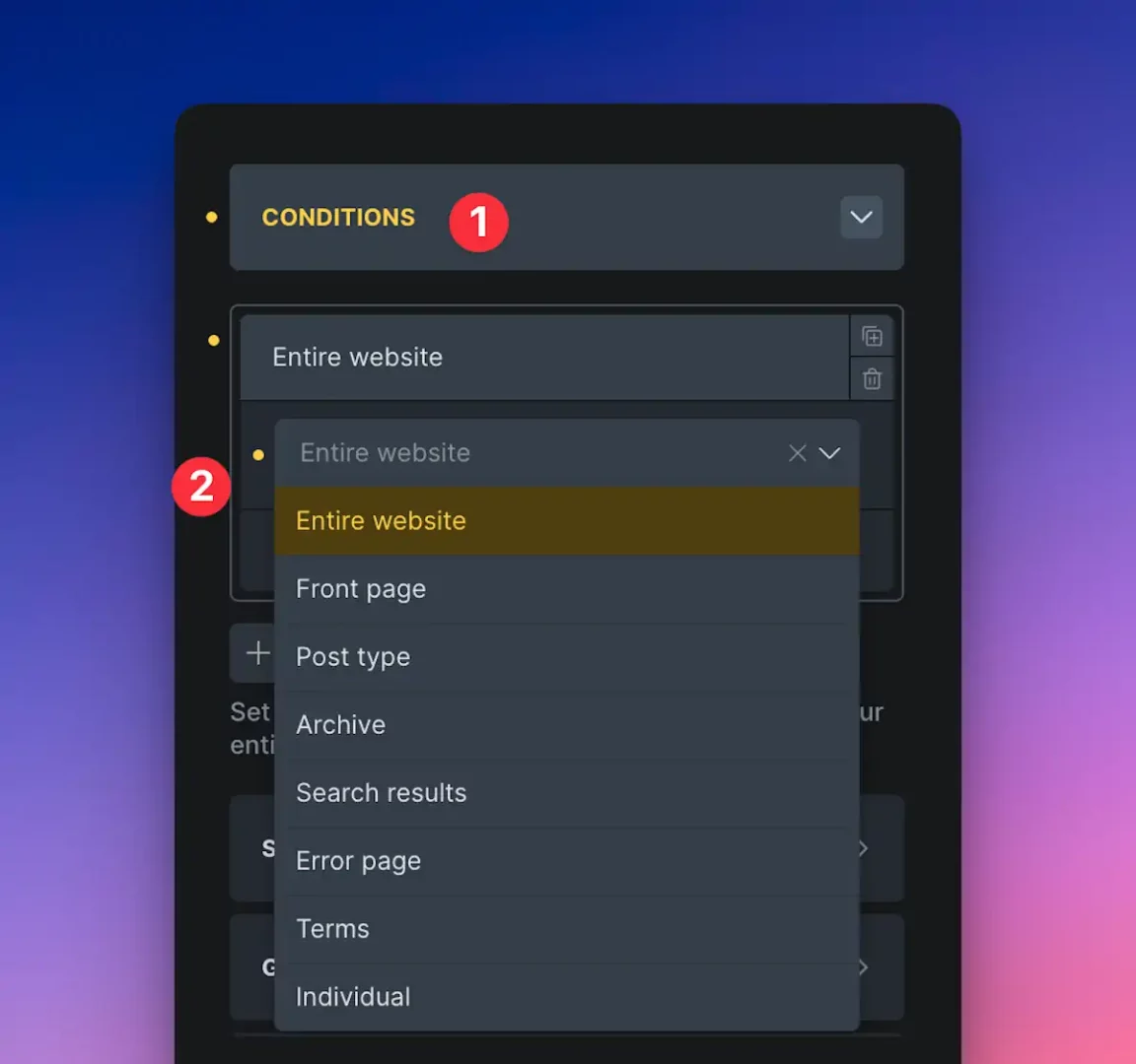
Apply them globally or get specific – it’s entirely up to you.
Setting the Basics – Colours and Layout
Now with your Theme Style ready, it’s time to dive into the fun bits:
General Layout: Select between a wide or boxed layout style. You can also set background colours and how your lightbox behaves.
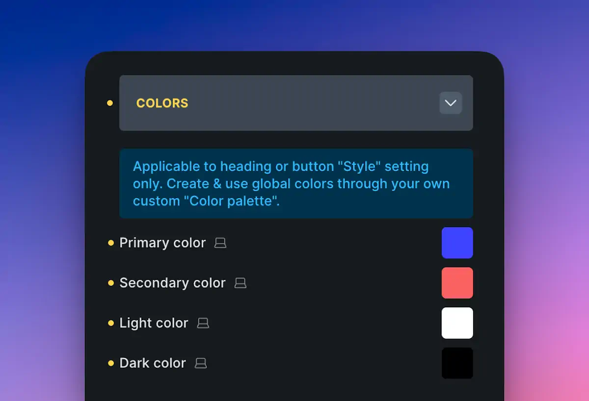
Colours: Define global colour values—primary, secondary, light, dark, etc. These global colours will now apply consistently across your design.
Links: Would you like all links to have a specific hover style or underline? Set it once here.
Set it properly at this stage, and you’ll thank yourself later.
Styling Elements Globally
The “Elements” section is where Theme Styles come alive. Every core Bricks element – including containers, sections, buttons, headings, and more – can have default styles.
This means when you add a new container or button, it doesn’t start completely plain. Instead, it’s styled based on the defaults you set here.
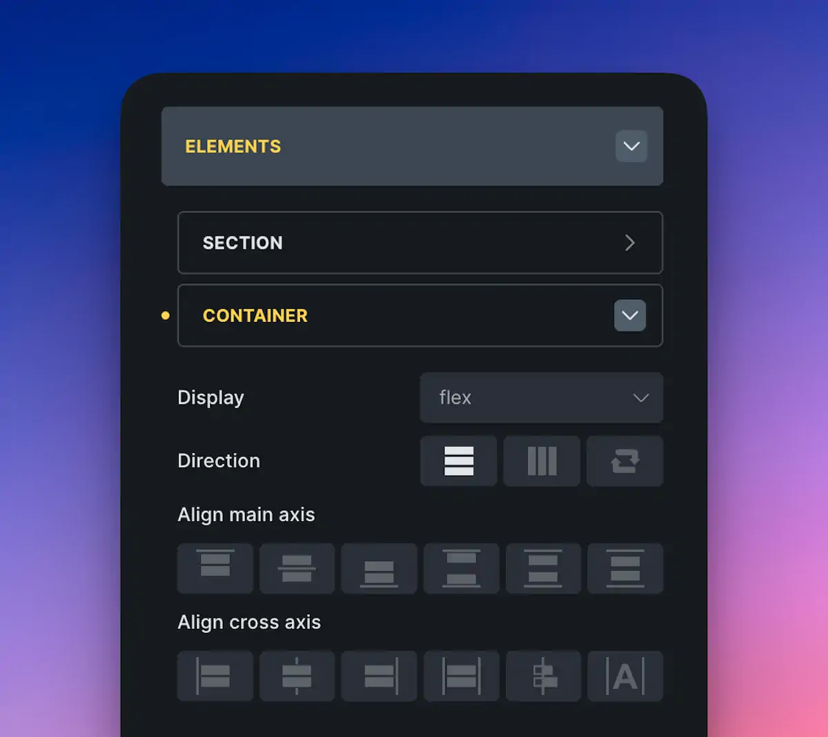
Let’s say you want all containers to have a max width of 800px – set that once, and every new container will follow suit. Want all buttons to use your brand colours and bold font? Do that once under the “Buttons” section – job done.
Typography – Keep It Consistent
Fonts, sizes, and line height – all super important for a polished website. Theme Styles allow you to define body text and heading sizes globally, ensuring your site has a consistent look and feel.
Top tip? Use variables for text sizes (and other values where possible). This way, if you decide to scale your text sizes later, you tweak one variable and everything updates automatically. You can create your own variables or use something like Core Framework to get started.
Contextual Spacing – A Bit of Magic
A newer addition in Bricks 2.0 is Contextual Spacing. It allows you to set spacing for specific HTML elements, such as headings and paragraphs, when they appear within containers like rich text blocks or WordPress content.
This is ideal for blog posts or Gutenberg content where you don’t manually control each heading.
You could remove all default margins and add your own – for example, all headings within rich text blocks could have 2rem spacing above. Want to tweak it? Just change the variable, and it updates everywhere. Neat!
Pop-ups, Style Sheets and Content Margins
Theme Styles also include:
Pop-up Settings: Scroll, fade, transitions – globally controlled.
Style Sheets: Need custom CSS? Create a style sheet directly in your Theme Style and apply it conditionally.
Content Margins: Set general margins for your content areas.
While these are slightly more advanced features, they’re helpful and demonstrate the extensive control Bricks provides.
Export and Reuse Your Theme Styles
Once your Theme Style is perfected, you can export it as a JSON file. Bring it into new projects with just a few clicks. Huge time-saver!
Better still? Create a base “blueprint” setup – include your favourite Theme Style, variables, templates, and frameworks. Then use that to kickstart every new project.
Final Thoughts
Working with Theme Styles in Bricks Builder isn’t just about saving time – it’s about designing smart. With everything set once, you get that consistency across the site that clients love and users notice.
Start simple – colours, buttons, containers. Then play with variables and contextual spacing when you’re ready to go deeper. The effort up front makes your builds faster, cleaner, and easier to maintain in the long run.