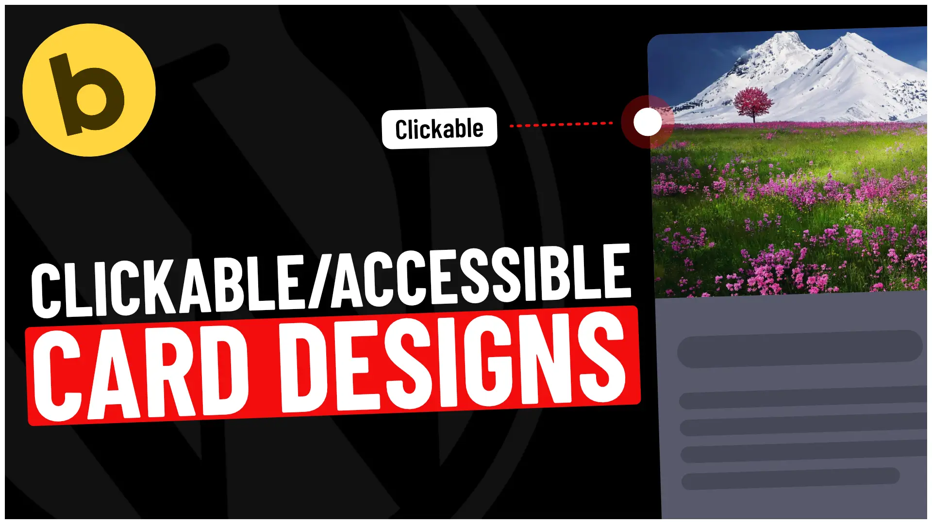
The Goal
- Make the entire card clickable (instead of only individual links).
- Ensure the card design is accessible for keyboard and screen reader users.
Step-by-Step Guide
Step 1: Set Up Your Card in Bricks Builder
1. Create a Card Structure:
- In Bricks Builder, add a Block element for your card.
- Inside the block, add an Image, a Heading (for the title), and a Text element (for the description). You might also add buttons or other interactive elements.
2. Add a Link:
- Add a link to the Heading element inside your card. Typically, this link leads to the complete content or product page.
- The following steps will expand this link to cover the entire card, making it more intuitive for users to click anywhere within the card.
Step 2: Add Custom CSS in Bricks Builder
We’ll add custom CSS to the parent card block to make the entire card clickable.
1. Open the Settings for the card block:
- In Bricks Builder, click on the block element of your card.
- Go to the CSS tab and add the following CSS code. You can use %root% as a placeholder for the card container.
/* Apply this code to the parent container of the card. */
%root% {
  position: relative; /* Establish a reference point for absolute positioning of the link. */
}

/* Expand the clickable area of the heading link to cover the entire card. */
%root% h3 a::before {. /* change this based upon your clickable elements HTML definition */
  content: ' '; /* Adds a pseudo-element to cover the container. */
  inset: 0; /* Stretch the pseudo-element across the entire card. */
  position: absolute; /* Position it absolutely within the parent container. */
  z-index: 1; /* Ensure it is on top of other elements, so the entire card is clickable. */
}

/* Provide a focus outline when a user interacts with the card using the keyboard. */
%root%:focus-within {
  outline: 2px solid #0073aa; /* WordPress blue for accessibility focus indication */
}

/* Remove conflicting focus styles from individual elements inside the card. */
%root%:focus-within :focus {
  box-shadow: none; /* Remove extra focus indicators like shadows */
  outline: none; /* Disable browser's default outline on links */
}
Step 3: Test for Accessibility
To ensure your card design is accessible, follow these steps:
1. Test Keyboard Navigation:
- Navigate to your site using the Tab key. Ensure that when you focus on the card, the outline appears around the entire card, showing it’s clickable.
- Ensure all interactive elements within the card (like buttons or additional links) can still be individually focused and activated.
2. Screen Reader Accessibility:
- Screen reader users should receive clear feedback about where the link inside the card goes. Adding ARIA labels to your link or parent container can help. This can be done via the Bricks Builder interface or in your HTML directly:
<div class="card-container" tabindex="0" aria-label="Clickable card leading to full content">
   <h3><a href="your-link-here">Card Title</a></h3>
   <p>Card description here...</p>
</div>
Step 4: Add Additional Accessibility Features
While the card design is now functional and accessible, you can enhance it by adding the following:
- ARIA Roles & Labels: If your card contains multiple interactive elements, such as buttons or links, consider adding ARIA roles or labels to provide extra context for screen readers. Bricks Builder allows custom attributes under each element’s “Attributes” section.
- Focus Styles: In the provided CSS, we use a focus-within selector to add an outline to the entire card when it receives focus. This helps users who rely on the keyboard to see where they are on the page. You can adjust the colour or style of the outline to match your site’s design.
Final Thoughts
By following these steps in Bricks Builder, you’ll create a card design that’s fully clickable and accessible for all users. This approach ensures that keyboard and screen reader users can easily interact with the content while improving the overall user experience.
Integrating such features in your designs will help your website meet accessibility standards (such as WCAG 2.1), making it more user-friendly for a broader audience.
Now you’re ready to go! You can use this approach across different parts of your site to create dynamic, clickable, and accessible content in Bricks Builder.