If you’ve already seen how to set up colours in Bricks (which we covered in a previous video), you’re ready to take the next step: creating and managing spacing variables.
The cool part? Once you’ve set this up, updating spacing across your whole site becomes easily manageable and incredibly flexible.
Getting Started with the Style Manager
To access the new CSS framework features, head to the top left corner of the Bricks editor and click on ‘Styles’. This opens the style manager, where you’ll find a sidebar with sections: Classes, Variables, Colours, Typography, and Spacing.

Make sure you have a theme style created. This can be completely blank, as we’re starting from scratch to give you full control over your spacing setup.
Once open, hit the full-screen icon for a cleaner workspace. You can also toggle the preview on and off or switch between desktop, tablet, and mobile views.
Setting Up Your Spacing Scale
Now, let’s jump into the Spacing section.
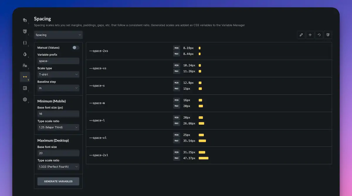
- Start by clicking ‘Create scale’ and name it “spacing” (or any name you prefer).
- Once created, you’ll see a list of spacing sizes, ranging from 2XS to 2XL by default.
- This scale is referred to as a “t-shirt” scale, using familiar sizes like small, medium, and large. If you prefer numbers (1, 2, 3…), you can change the scale type to Numeric or fully customise it.
Key Settings
- Variable Prefix: By default, it’s set to “space”, meaning your CSS variables will look like –space-m, –space-l, and so on.
- Baseline Step: Typically set to 16px (standard body text size on the web). That’s your “M” value.
- Minimum and Maximum: Controls how values scale from mobile to desktop. For example, if Medium (M) starts at 16px and maxes out at 20px, everything scales between them, depending on screen size.
- Scale Ratio: Controls how each step increases or decreases. A 1.25 setting means each size is 1.25 times larger or smaller than the previous one.
When you’re happy with your settings, click ‘Generate Variables’. This creates your CSS variables using the clamp() function for fluid responsiveness—no awkward jumps between screen sizes.
You can even expand your scale (e.g., add 3XL and 4XL) using the plus icon next to the values. Don’t forget to generate variables again whenever you make changes.
Where to Find the Generated Variables
Once generated, head to the “Variables” tab, and you’ll see your new spacing values neatly listed under the “Spacing” category. These can be used throughout your design process in Bricks.
Using Spacing Variables in Your Layout
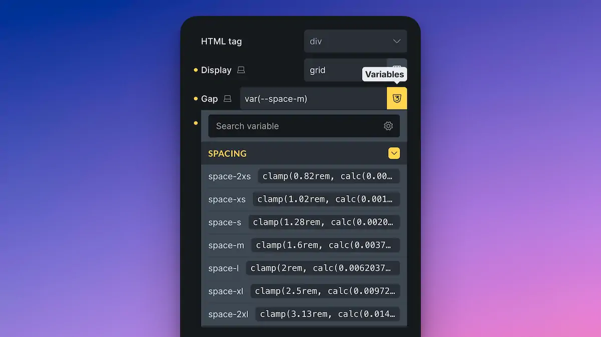
Let’s see how those variables work in practice:
- Suppose you have a container with a few items. Select the container and set its display to Grid.
- You’ll notice there are no gaps by default. Under the ‘Gap’ option, open the Variables panel, go to your “spacing” scale, and select the value you want, for instance, –space-m.
- Do the same when setting spacing within individual elements, such as cards or sections. For example, setting the row gap between child elements.
What’s great is that if you decide your spacing needs tweaking later, you can head back to the Style Manager, adjust your scale, regenerate your variables, and everything updates site-wide.
Creating Utility Classes for Reusable Spacing
Want to save time by creating preset spacing options you can apply quickly across your site? Enter utility classes.
- In the Spacing section, scroll down to Utility Classes and click ‘Add Utility Class’.
- Name your class something like padding-* — the asterisk acts as a wildcard for multiple sizes (2XS to 4XL, for example).
- Set the CSS property to be affected, such as padding. You could use padding-top, margin-left, and similar properties, depending on your needs.
- Click ‘Generate Utility Classes’. Bricks will automatically create one class for each size (padding-2xs, padding-m, etc.).
Now, back in your design, apply these utility classes directly to any element. Handy when you want consistent padding or margin across similar elements, say, image blocks or cards.
Summary: Why This is a Game-Changer
Using Bricks 2.2’s CSS framework features, you can:
- Create fluid, responsive spacing with ease.
- Centrally manage and update spacing site-wide.
- Use intuitive naming via the ‘t-shirt’ scale.
- Apply spacing quickly using utility classes.
Whether you’re building a single landing page or a large-scale site, this approach keeps your design consistent, manageable, and scalable.
Hopefully, this guide makes things clearer and helps you feel confident using spacing in Bricks 2.2. If you’d like to learn about the other new features, such as setting up colours or typography, be sure to check out the other videos in the series.
Until next time, enjoy building!